Overview
MARTA, the Metropolitan Atlanta Rapid Transit Authority,
ranks as the 8th largest public transportation agency since its establishment in 1971, offering vital transit services via buses and trains to both locals and visitors. With a mission to promote safe and equitable transit, MARTA serves a diverse population.
However, MARTA's mobile app, Breeze, currently poses accessibility challenges for users with visual impairments, particularly in navigating ticket purchasing due to complex submenus. Redesigning the app with a focus on inclusivity can streamline navigation and enhance accessibility, making MARTA's services more user-friendly for a broader audience.
Research
I conducted user interviews and usability testing on the existing MARTA Breeze app. I asked both Atlanta residents and non-residents to explore the app independently while I observed their interactions. I recorded their feedback and behaviors to identify usability issues across key screens.
“There are a lot of features that are just put there but do not have any explanation on what they’re doing. I’m just confused”
Journey Mapping
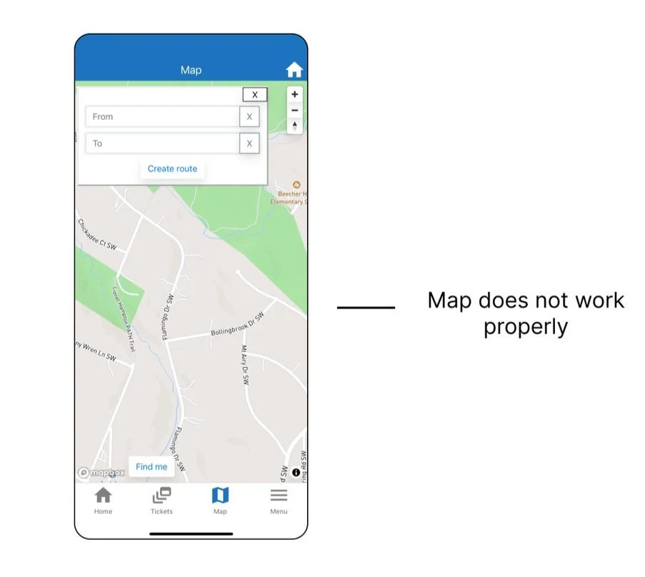
From these sessions, I mapped out the user journey to pinpoint where confusion, frustration, and drop-offs occurred — especially around ticket purchasing and real-time navigation. The following were notable pain points with the original App.
Home Screen
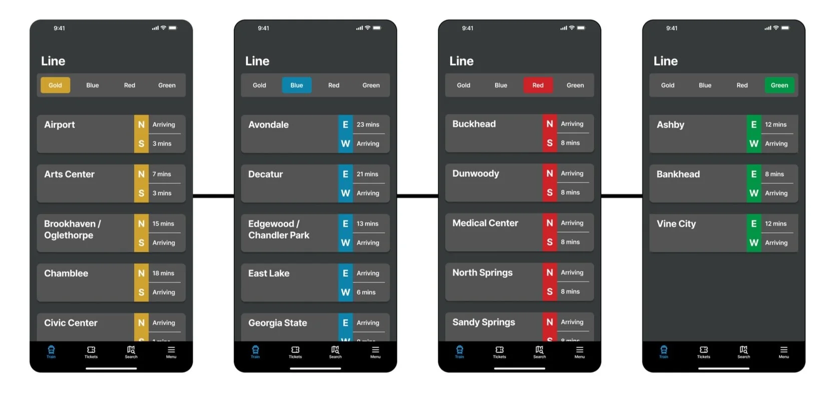
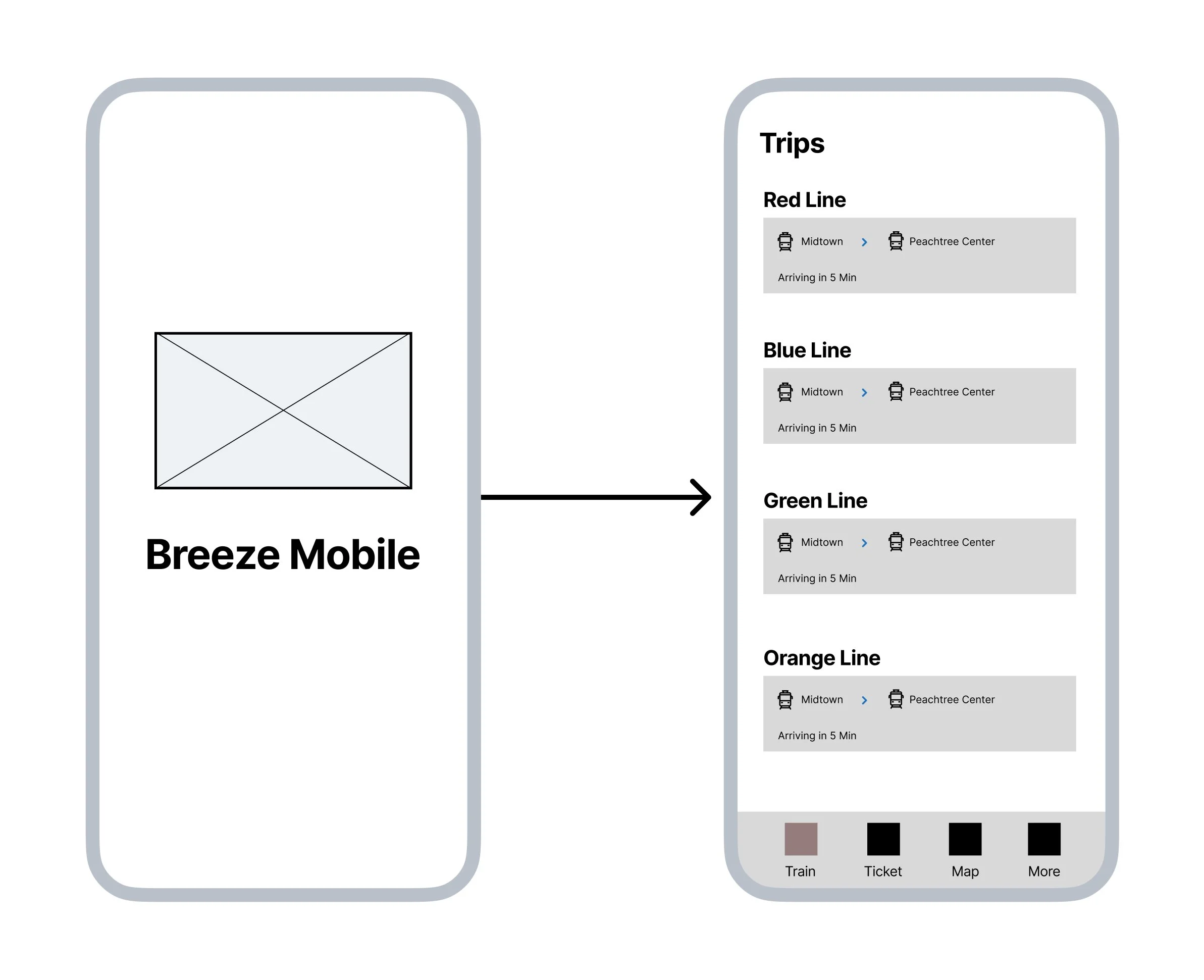
The updated home screen displaying the user’s current rail line and upcoming train arrival times, allowing for quick, at-a-glance updates without navigating through multiple screens.
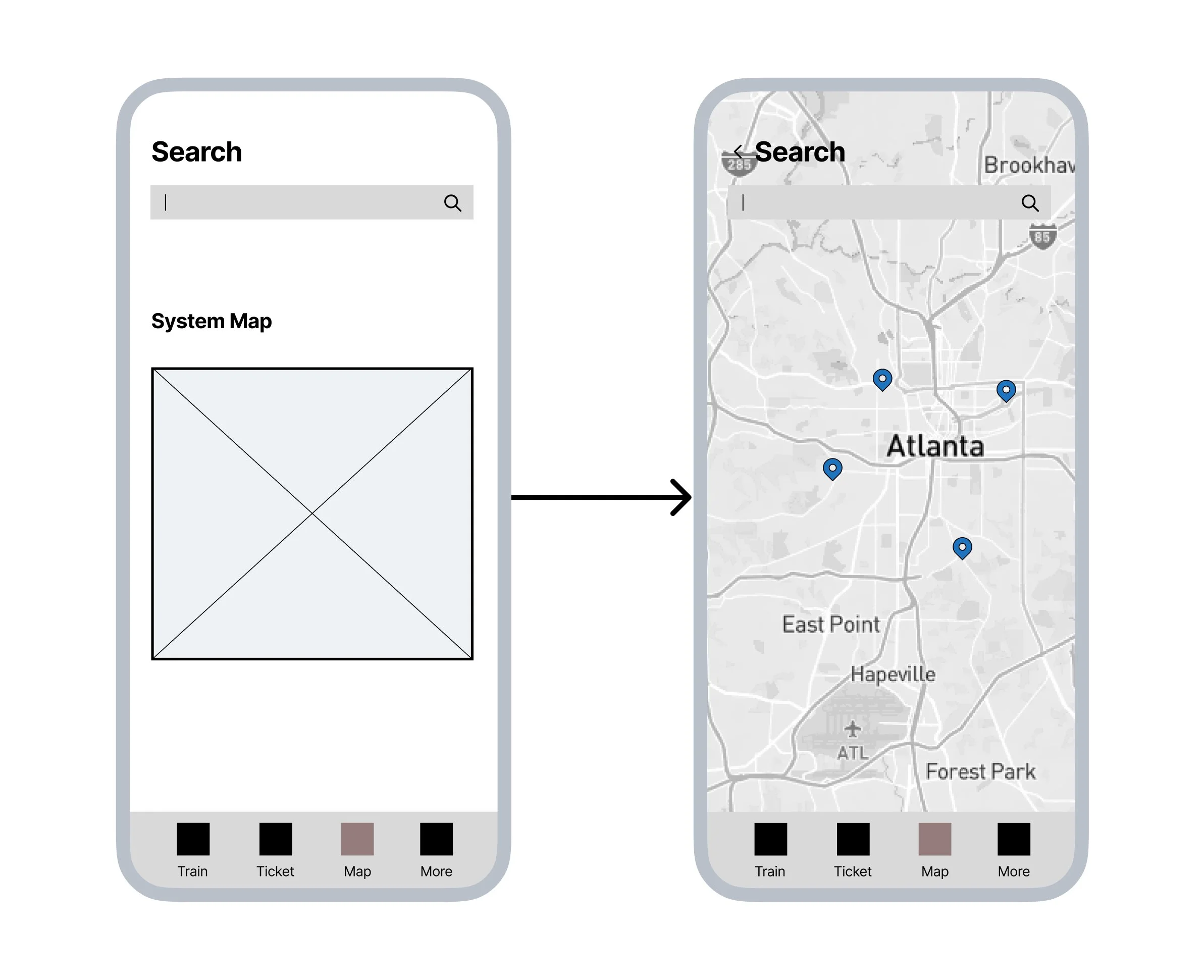
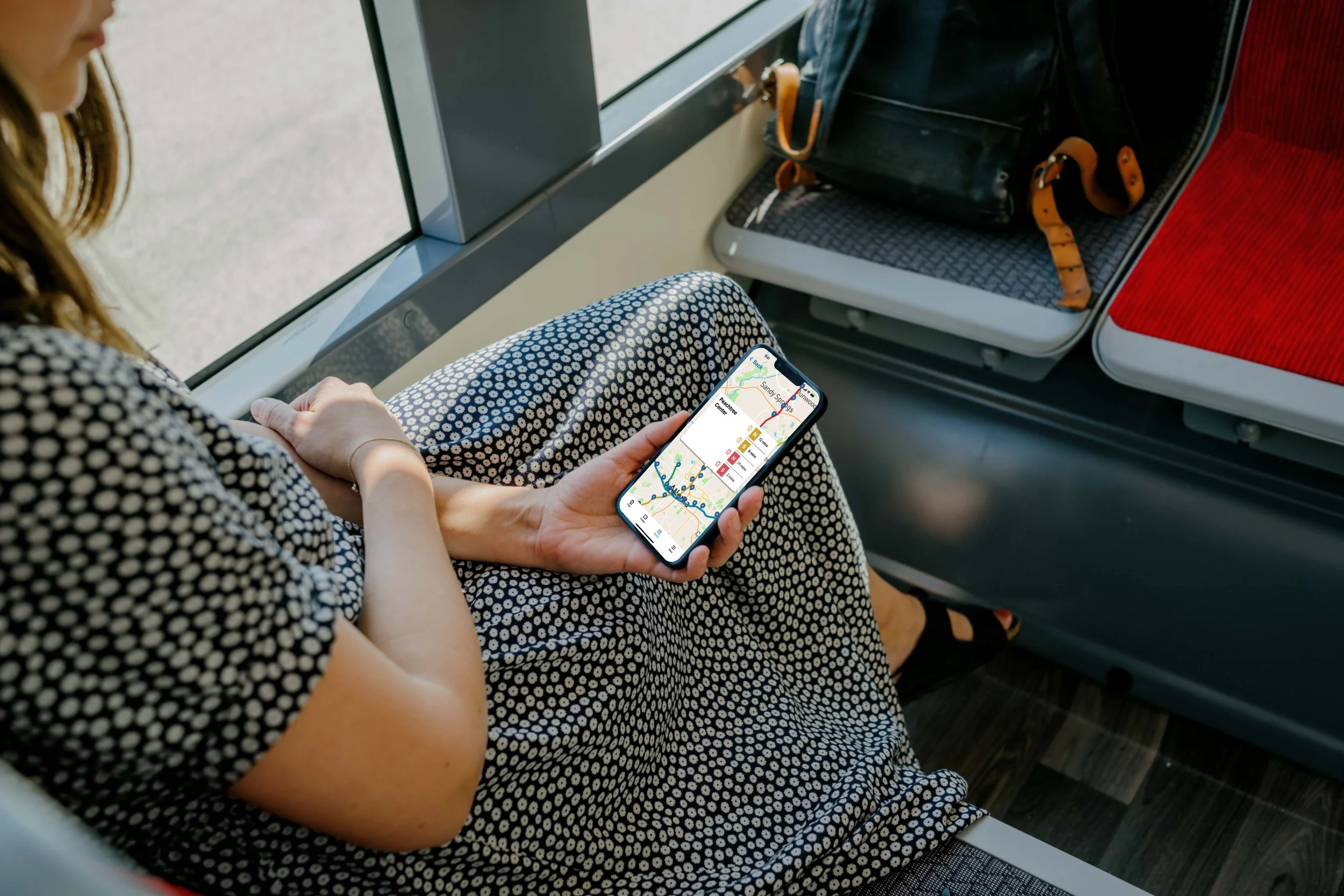
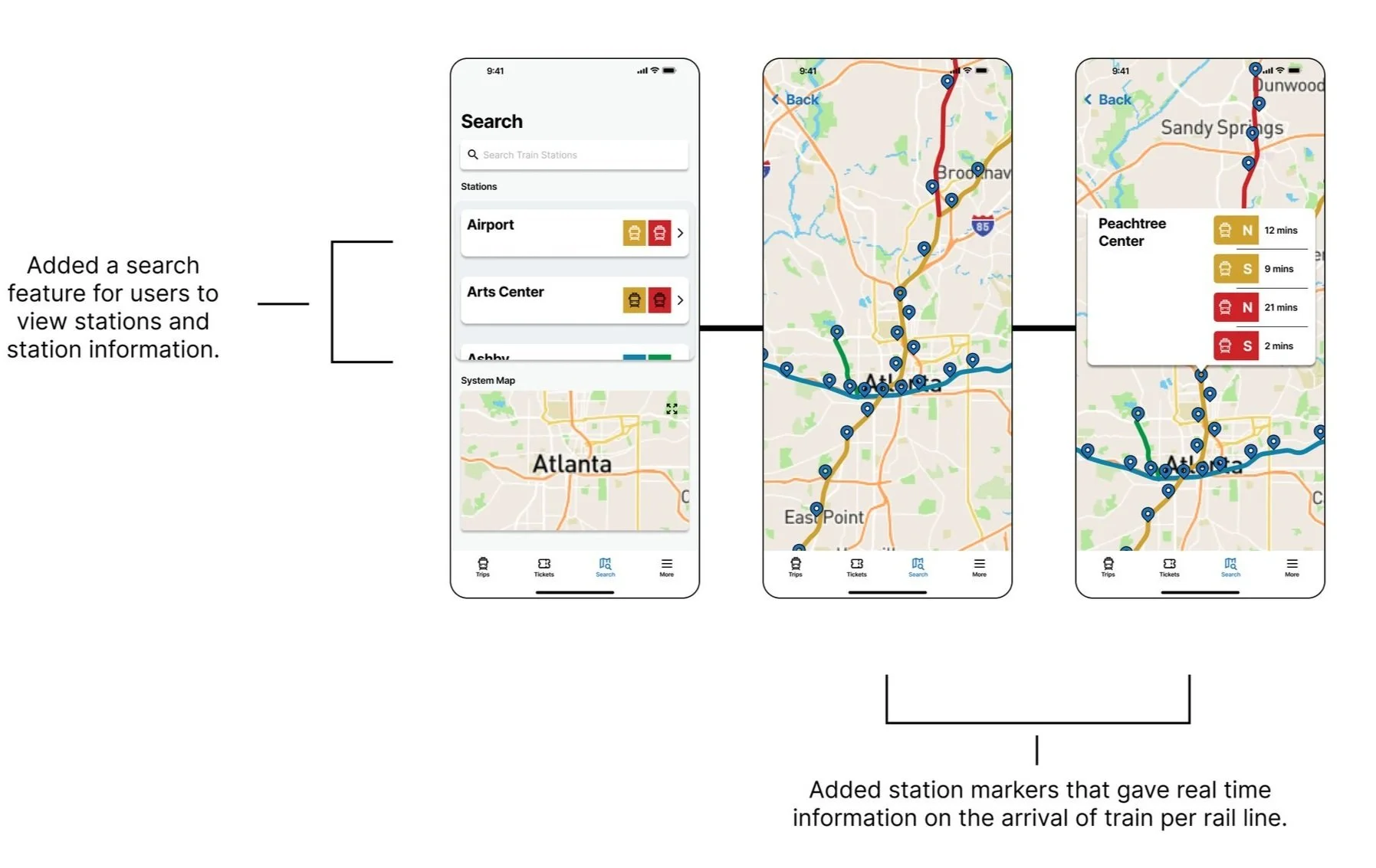
With the updated map section, users can quickly view the full rail system and clearly identify their current station, making it easier to navigate and understand the MARTA network at a glance.
Redesigned Map Screen
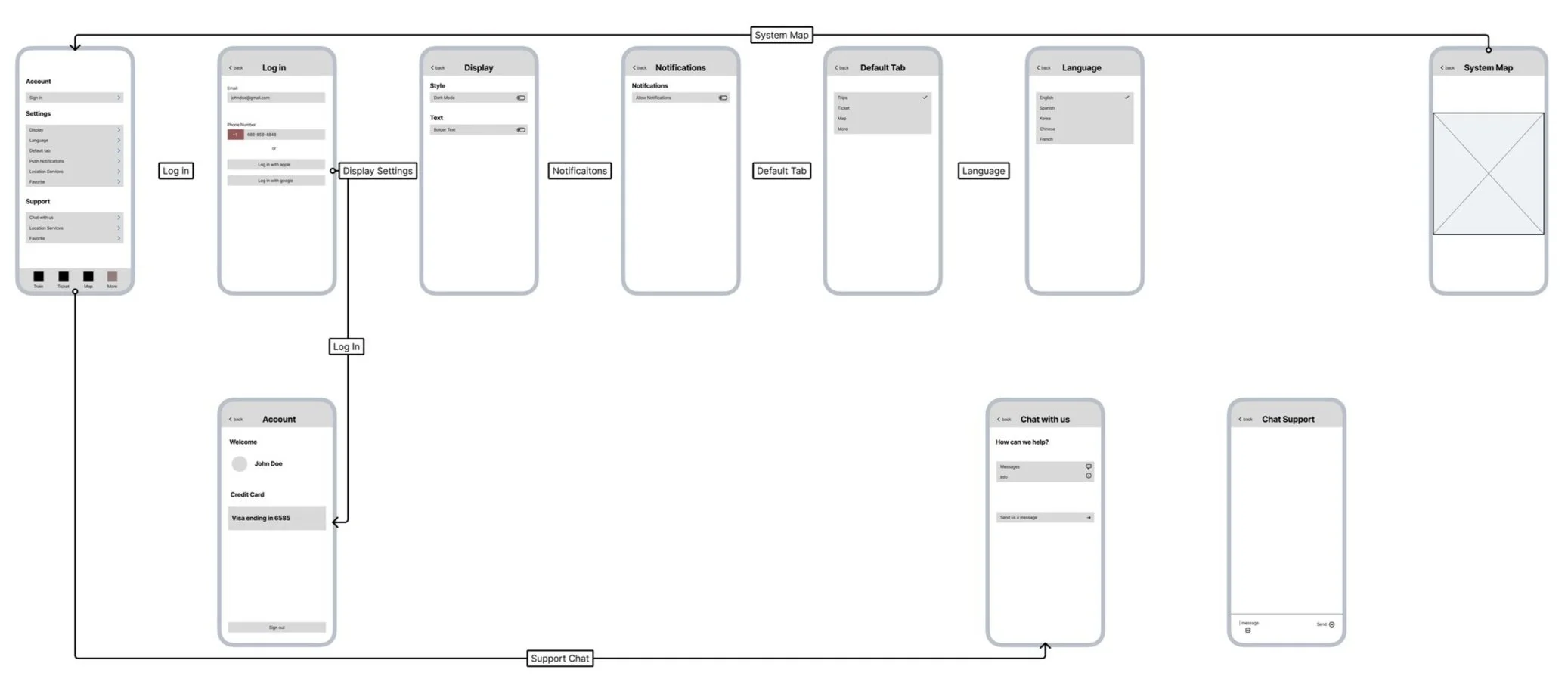
Redesigned Settings
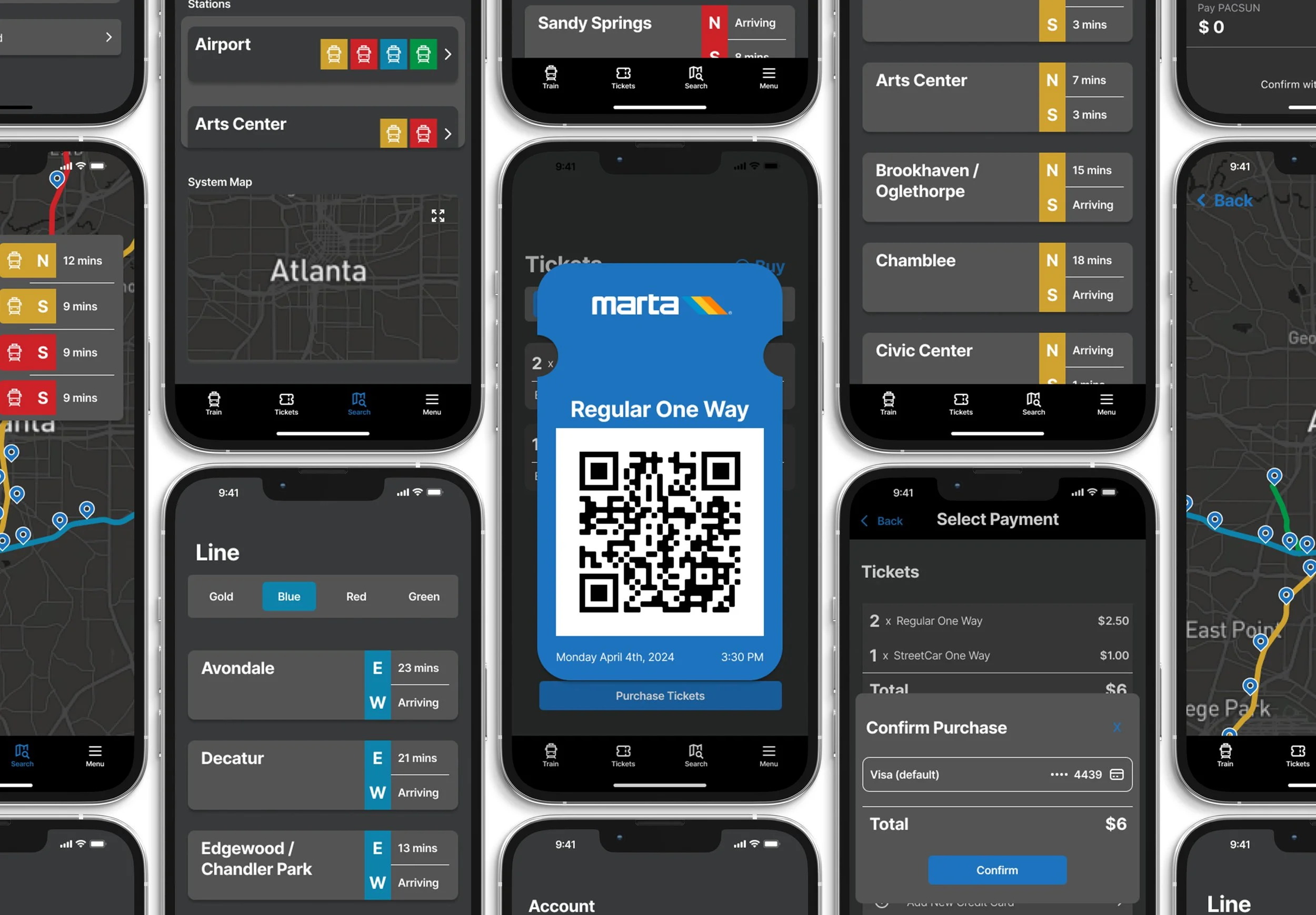
In the settings, I designed options to enhance usability, including the ability to enable dark mode for improved contrast, reduced eye strain, and better accessibility in low-light environments.
Redesigned Ticket Purchasing
For the ticketing experience, I streamlined the flow to allow users to easily add multiple tickets and activate them with fewer steps. I also incorporated clear, in-context instructions to help users understand how to use their digital tickets effectively during transit.
Walk Through
Redesigned Home Screen
Redesigned Map Navigation
Redesigned Settings
Redesigned Ticket Purchasing
Redesigned Ticket Usage
Reflection
At first, I underestimated the complexity of this project, focusing on updating MARTA's app after finding it difficult to use myself. Recognizing the potential challenges for users, especially those with visual impairments, I redesigned the MARTA Breeze App. Through diverse user testing, I gained valuable insights into user interface design and learned to consider the app's overall experience rather than just specific features.
Despite initial challenges, including neglecting certain aspects during wireframing and struggling with prototyping tools, I persevered and enhanced the app's functionality. This project has provided invaluable industry insights and opportunities for growth, preparing me for my career ahead. Although there's room for improvement, I'm proud of the app's representation of my current skills and eager for future opportunities.
Redesign & Comparison
Figma Prototype
Original Home Screen
Original Map Navigation
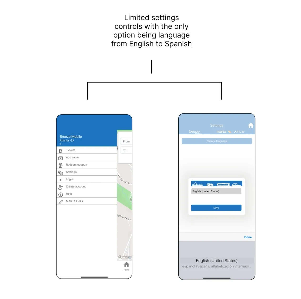
Original Settings
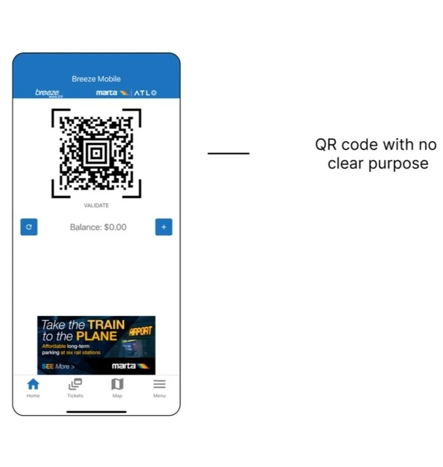
Original Ticket Purchasing
Original Ticket Usage
Ticket Purchasing Navigation
Ticket Usage Navigation
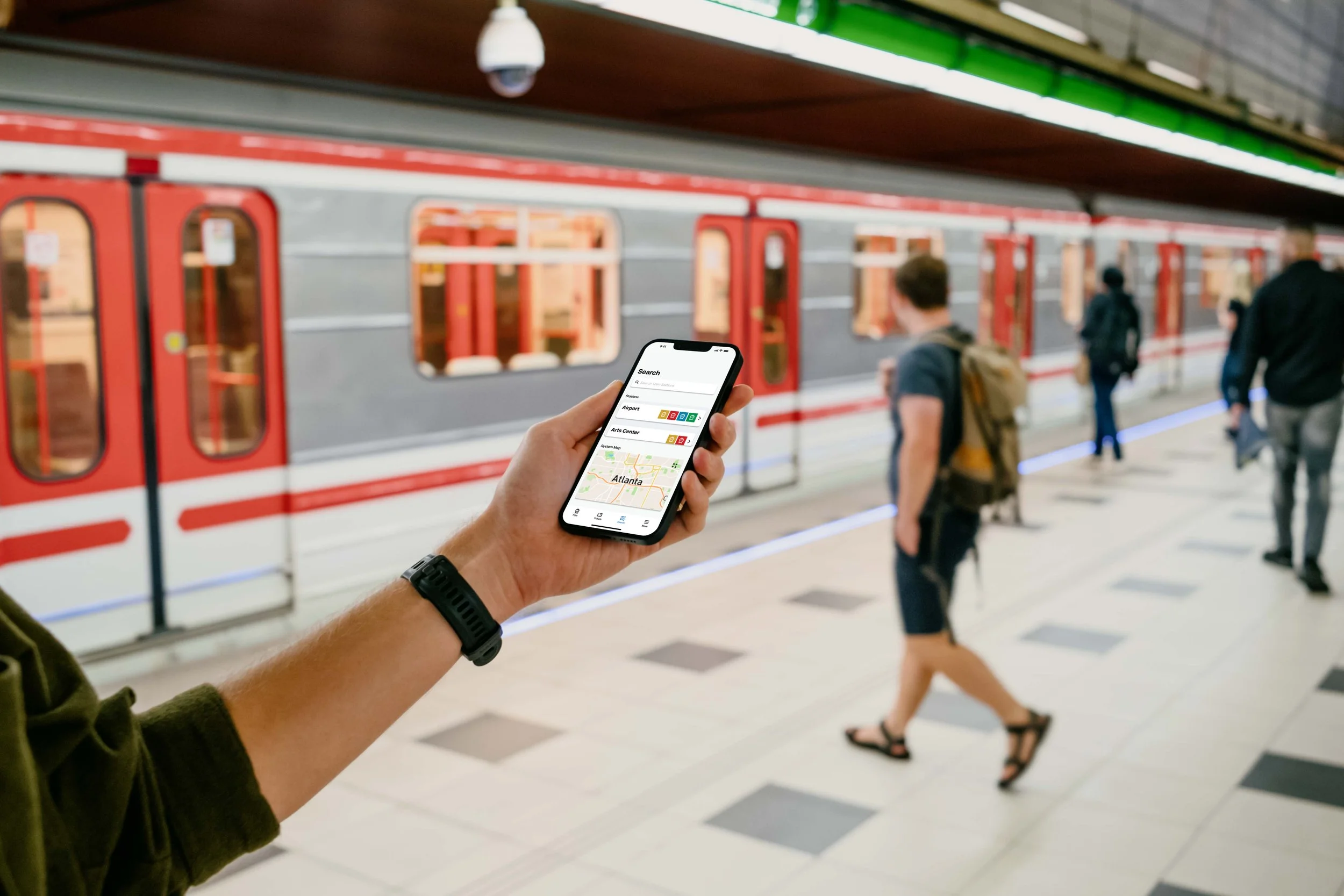
Based off of the research and goals mentioned above, I created my reenvisioning of what the Marta App could look like.
Redesigned Home Screen
Breeze Mobile
A reenvisioning of Atlanta’s Transportation App
Role: UX/UI Designer - Solo Project
Tools: Figma, Fig Jam, and Adobe Illustrator
Timeline: 3 Weeks
Focus: Accessibility, Usability, Mobile UI
Map
Settings
Redesign Goals
1. Simplify ticketing process: Goal is to streamline and clarify ticket purchasing for users.
2. Add live updates: Include arrival times for buses and trains in the app.
3. Redesign map: Enhance clarity of MARTA lines and stations for easier route exploration.
4. Revamp settings: Improve functionality and add useful features and options.
5. Visual update: Enhance text hierarchy and color contrast for improved readability.
6. Dark mode: Introduce higher contrast option for users with visual impairments.


